Watch: What’s In a Film’s Setting? Plenty.

Watch: What’s In a Film’s Setting? Plenty.

If pressed, I would probably say that I respond more to films with a more attuned sense of setting. Part of the experience of moviegoing is tucking yourself into something–a director’s sensibility, a created world–and staying there for a while, and this tucking-in is made far more immediate if the physical setting makes a strong impression on you. In a new video essay, Now You See It swims through various setting-heavy films, ranging from ‘Citizen Kane’ to ‘About Schmidt’ to ‘The Life of Pi’ to ‘Fargo,’ and does a solid, old-fashioned analysis of the settings of those films, and why they’re important. The piece is particularly shrewd on ‘Little Miss Sunshine,’ with the socioeconomic transparency of the beauty pageant at the film’s end. So what’s in a film’s setting? The viewer, for the all-too-brief span of the film.

Watch: Guillermo del Toro Is a Master of Disobedience

Watch: Guillermo del Toro Is a Master of Disobedience

In disobedience lies Art. In disobedience lies Progress. From Aristophanes to Cervantes to The Beatles to Jackson Pollock to Jean-Luc Godard, we are taught, repeatedly, by example, that, to quote many a sports film, those who break the rules make the rules. In his latest virtuosic video essay, Evan Puschak, aka "NerdWriter," takes us inside the work of Guillermo del Toro, showing that in films such as ‘Pan’s Labyrinth‘ and beyond, the director breaks the rules of storytelling, violating the form that the Grimm’s Fairy Tales put before us, as his characters work against story paradigms to carve out spaces for themselves–and the results have been stupendous, making del Toro an idol for those who privilege the imagination over all that would conspire to crush it.

Watch: David Fincher and Niels Arden Oplev Take On The Revenge Scene in THE GIRL WITH THE DRAGON TATTOO

Watch: David Fincher & Niels Arden Oplev Direct The Revenge Scene in THE GIRL WITH THE DRAGON TATTOO

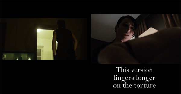
Anyone who likes Greek tragedy should, by rights, appreciate Stieg Larsson’s Millennium Trilogy, a series of books built on the power of revenge, and the catharsis that grows out of it, a catharsis so palpable it’s practically sexual. The revenge scene in The Girl with the Dragon Tattoo, the trilogy’s first volume, unfolds at a pace that is as scorching as it is satisfying, as Lisbeth Salander, the punkish information scientist thug genius, punishes her perverted legal guardian for his brutal molestation of her. When Niels Arden Oplev and David Fincher adapted the book for the screen, they took different approaches to this scene. While one version is not necessarily less fist-pump-worthy than the other, watching the scenes side by side points up crucial stylistic differences between the two directors. Here to walk us through these differences is Kevin B. Lee, for Fandor. It’s all spelled out for us here, with great care–and with huge captions! Enjoy! (If you have the stomach for it.)

Watch: Quentin Tarantino’s Shots from Above Put Him in the Center of the Frame

Watch: Quentin Tarantino’s Shots from Above Put Him in the Center of the Frame

Generally, shots from above serve to belittle the action taking place on screen; they remind us that, regardless of how involved we may be in the events unfolding there, we are all merely ants skittering across the surface of Earth, and the plot of the film is, really, just that. But in Quentin Tarantino’s case, the impact is slightly different. Emphasis is indeed taken off the action on-screen, but it is placed back on… the director. When we see an overhead shot in a Tarantino film, we are reminded that the film we are watching is personally crafted and bears the weight of significant personal investment–it’s somewhat of an auteur’s calling card. In Pablo Fernández Eyre’s latest piece, he takes us through shots in films ranging from Pulp Fiction to Jackie Brown to Kill Bill Vol. 2, to show us the director’s removed control at work.  

Watch: Damien Chazelle’s ‘Whiplash’ and Darren Aronofsky’s ‘Black Swan’ Are the Same Film

Watch: Damien Chazelle’s ‘Whiplash’ and Darren Aronofsky’s ‘Black Swan’ Are the Same Film

It cannot be denied that Damien Chazelle’s ‘Whiplash‘ and Darren Aronofsky’s ‘Black Swan‘ are disarmingly similar. There’s the young naif at the heart of each film, Miles Teller’s Andrew Neimann vs. Natalie Portman’s Nina Sayers. There’s the overbearing instructor looming over each story: J.K. Simmons’ Terence Fletcher vs. Vincent Cassel’s Thomas Leroy. And there’s also the drive towards an artistic goal that ultimately leads a protagonist into the depths of his or her own creative self. And, as Fernando Andrés points out in this excellent video essay, which lays out considerable connections between the two films, both works focus on a particular body part that embodies the struggle at the story’s heart. In ‘Whiplash," it’s the hands; in "Black Swan,’ it’s the feet. Revisiting these two films in this form is edifying in and of itself, but the comparison so elegantly explored here also reminds us of something else behind all artistic endeavors: tenaciousness. Not quitting. Never thinking that one has done, to quote J.K Simmons’ sadistic but half-right teacher, a "good job." Suffering comes out of this kind of determination, and plenty of it. But that thing which we call, broadly, "art" comes out of it, too.

Watch: How Aspect Ratio Limns a Film Director’s Vision

Watch: How Aspect Ratio Limns a Film Director’s Vision

You only know as much about a film as a director tells you. You only see as much, furthermore, as the director allows you to see. And, in considering the story within a film, you may think you are looking outwards when you allow the film to inspire expostulations and intellectual ramblings–and yet you are, in fact looking inwards, deeper into the images unrolling above you. One way we are reminded of this is through aspect ratio, which is, for the layperson, simply the proportional relation between the width of the frame and the height of the frame. De Filmkrant‘s video essay addresses the use of and experimentation with this element in recent films. Xavier Dolan’s frame tightens slowly on a woman’s face, going slowly out of focus; in another Dolan scene, a character actually pries the screen wide open. In Gust Van den Berghe’s ‘Lucifer,’ a circular frame is used throughout, giving the whole film, and subsequently its story, the quality of a vignette, from a film of an older era. Joost Broeren and Sander Spies, the video essay’s editors, attribute some of this experimentation with aspect ratio to the growth of digital filmmaking, but not all, in this survey of directors ranging from Wes Anderson to Ang Lee, and beyond. 

Watch: 100 Great Moments of Film Editing and 5 Crucial Visual Punctuation Marks

Watch: 100 Great Moments of Film Editing and 5 Crucial Visual Punctuation Marks

Watching a film is reading a book, and reading a book is watching a film. There’s really no difference. In one case you sit quietly in the dark as the light flows over you; in the other case you sit quietly in a lighted room as the text washes over you. The difference between the two is an academic distinction. In both cases, you take in what you see, either on a screen or on the page; you take an experience away from it; you make it yours as you assign structure and significance to its parts. Why else do you think so, so many films are based on books? This video essay by Max Tohline is an important one, which takes up this overlap with considerable energy and intelligence. Twenty minutes in length, it takes its inspiration from a Kathryn Schulz piece on the 5 best punctuation marks in literature, such as a famous ellipsis in T.S. Eliot’s ‘The Love Song of J. Alfred Prufrock’ or an oddly placed colon in Charles Dickens’ ‘A Christmas Carol.’ What Tohline manages to do is apply Schulz’s observations to film analysis, with wholly convincing results. A comma placed between two items which implies a relationship between the two (as in Nabokov’s famous "(picnic, lightning)" in ‘Lolita’ becomes the equivalent of a jump cut which makes equivalencies where there would seem to be none on the surface, as in the leap from the bone flung in the air in Stanley Kubrick’s ‘2001: A Space Odyssey’ to a vast white craft floating smoothly through outer space, centuries later. The ellipsis from ‘Prufrock’ becomes the equivalent of a moment in which Woody Allen’s malcontent in ‘Hannah and Her Sisters’ seeks respite from despair by seeing, in an example of omitting a part of a story for comic effect… a Marx Brothers film. And so it goes. Tohline shows us clips from 100 films in which editing made all the difference; the list, posted at Tohline’s blog, includes everyone from the Coen Brothers to David Lynch to George Melies to Martin Scorsese to Dziga Vertov to Francois Truffaut–and could serve as a great primer for students of film editing, in and of itself.

Watch: David Bowie, ‘The Man Who Fell to Earth,’ and an Immortal Soundtrack

Watch: David Bowie, ‘The Man Who Fell to Earth,’ and an Immortal Soundtrack

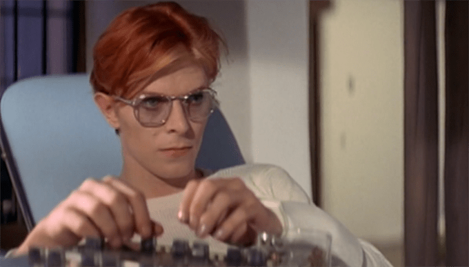
When they made this video essay for Film Comment on Nicolas Roeg’s ‘The Man Who Fell to Earth,’ Sean Doyle and Violet Lucca must have been reading my mind. From time to time, I (re-)listen to David Bowie, always with the same objective: trying to determine if his songs, with their esoteric lyrics and winding melodies, are actually good, or just products of a period, and moreover of an impenetrable affect. Most often my conclusion lies with the former. This video did little to sway me one way or the other on that question, but what it did do was educate me on the history of a remarkable film, most notably the history of its soundtrack. Bowie wrote a soundtrack for the film, but director Nicolas Roeg went with John Phillips, previously of The Mamas and the Papas, for the job. While Bowie’s soundtrack would probably have had an appropriately whacked-out tone for the film’s central character, alien Thomas Jerome Newton, Doyle and Lucca show that Phillips’ soundtrack has its own rewarding complexities.  

Watch: John Cassavetes’ Cinematography Is the Key to His Work

Watch: John Cassavetes’ Cinematography Is the Key to His Work

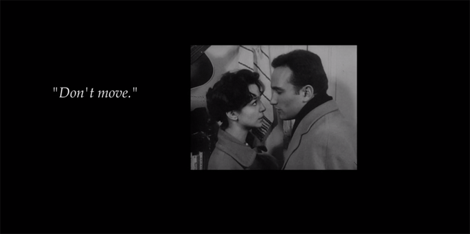
Interestingly, when watching Cassavetes’ work, the first thing I notice is the cinematography, as his films always represent an example of the idea that artfulness lies not so much in the story being told, but in the way it is told. In films like ‘Love Streams,’ ‘A Woman Under the Influence,’ or ‘Shadows,’ Cassavetes presents images of individuals in the midst of life being lived–and in so doing, may show actions onscreen that are not, in and of themselves, captivating. This is where the camera comes in, and our experience becomes more about how we see something than what we are seeing. Kevin B. Lee, in his latest video essay for Fandor, takes a close look at one of Cassavetes’ more close-up films, ‘Shadows,’ to show us, explicitly and with energized clarity, how Cassavetes’ angles, approaches, and recessions show us a mind at work showing other minds at work, in the process of growing, changing, and perpetually departing.

Watch: Martin Scorsese’s Best Slow-Motion Sequences… In Three Minutes

Watch: Martin Scorsese’s Best Slow-Motion Sequences… In Three Minutes

Martin Scorsese has acquired many trademarks over his 50-year filmmaking career. Perhaps the trademark he is best known for, something we are sure to expect when viewing a Scorsese picture, is his renowned use of slow motion. Nowadays, slow motion shots are a dime a dozen, being utilized by everyone from Michael Bay and Zack Snyder to Quentin Tarantino and Paul Thomas Anderson. When discussing such a popular (and possibly overused) technique, what makes Scorsese’s methods stand out and stick with us?

While the many blockbusters of today use slow motion to extend action and create drama, Scorsese seems to mostly use slow motion in order to enhance subjectivity. For example, the slow motion used during the quaalude-fueled beer pong match in ‘The Wolf of Wall Street’ allows us to experience the sluggish high of the characters. In "Shutter Island", Teddy’s flashbacks, dreams, and hallucinations contain slow motion in order to emphasize his false beliefs. While these two examples utilize obvious slow motion, Scorsese’s slow motion is perhaps best when it goes almost unnoticed. When Johnny Boy makes his famous entrance in ‘Mean Streets,’ minor slow motion is used to create tension on an almost subconscious level. As Travis Bickle watches Betsy from afar in ‘Taxi Driver", she glides through the crowd just slow enough to stand out a bit. This allows us to instantly feel Travis’ admiration–"They…cannot…touch…her." Scorsese does not use slow motion to to add style to his films; he uses it to tell us something. Here is a look at Scorsese’s use of slow motion throughout his prolific career.

Who’s That Knocking at My Door (1967)
Mean Streets (1973)
Taxi Driver (1976)
New York, New York (1977)
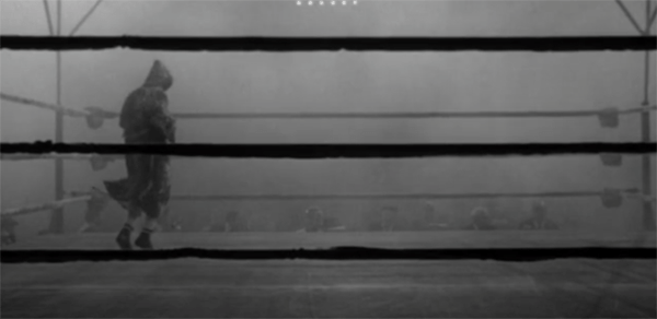
Raging Bull (1980)
The King of Comedy (1983)
After Hours (1985)
The Color of Money (1986)
The Last Temptation of Christ (1988)
Goodfellas (1990)
Cape Fear (1991)
The Age of Innocence (1993)
Casino (1995)
Kundun (1977)
Bringing out the Dead (1999)
Gangs of New York (2002)
The Aviator (2004)
The Departed (2006)
Shutter Island (2010)
Hugo (2011)
The Wolf of Wall Street (2013)

Jacob T. Swinney is an industrious film editor and filmmaker, as well as a recent graduate of Salisbury University.