
Rules hold sway over us, whether we realize it or not. Safety rules. Traffic rules. Rules of grammar. Laws. Codes of social behavior. Rules for arrangement of objects in your personal space. Rules for dress. Rules for business. The same holds true, oddly enough, when we watch films. We expect certain results. We expect certain placements, settings, orientations–and we even expect that the stories we enfold ourselves in will obey certain habitual patterns, will fall into place with a click. This character will fall in love with that character. Character X will win, and Character Y will lose. When it comes to visual rules, our expectations become a little harder to call out or examine because they are perhaps more engrained in us. The truth is, though, that it is the defiance of rules that makes a lasting work; whatever our expectations might be, the more eccentric works are the ones we remember. What better television show in which to examine the violation and transcendence of visual rules than the USA Network’s ‘Mr. Robot,’ as video editor Semih has done in this close-up, smart piece? Can you imagine a show about computer hackers that actually obeyed compositional rules?
Watch: ‘Mr. Robot’ Dances around the Rules of Composition
Watch: ‘Mr. Robot’ Dances around the Rules of Composition

I do love this show, because it leaves me guessing why they picked the composition they picked. The contrast between following the classic "frame within a frame" or "rule of thirds", or "golden ratio", followed by shots that breake all of these rules is fantastic! It makes you aware that somebody though of this. shots which have more then 80% background are so rare, its a pleasure to behold!
LikeLike
* […] instead of placing him on the RIGHT and leaving space at the back of his head).
LikeLike
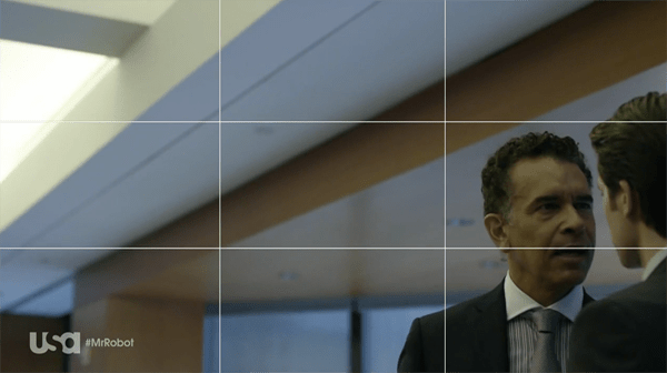
The rule of third is indeed followed, but what goes against convention is the choice of leaving so much head room around the characters, making them appear lonely in a massive empty space as if they were drowning in it. Also when people talk in films the most common device is the use of over-the-shoulder shots, or at least leaving room in the direction where the character is looking at (eg if guy is looking to the right he will be placed on the left leaving some space in from of him instead of placing him on the left and leaving space at the back of his head). Then again as Gary pointed out this breaking of conventions is so conventional that it even has a name, short siding.
LikeLike
They’re def. following the rule of thirds here. However, they’re consistently in the lower third, where you usually have a watermark in either the lower left and/or right corner. Having the point of focus in the bottom third left/right is def not a conventional nor a particularly audience-friendly way of shooting your show. Having said that, I’m in two minds whether i like it or not, it lends to the overall atmosphere of the show, certainly off kilter, like the show your watching is out of reach and about to fall off the screen completely, but I can only handle so many shots where the characters faces are covered by a station logo.
LikeLike
Most of those shots I believe are following the rule of thirds composition rule…subject maybe slightly off the exact line…but more or less its there. Isn’t it?
LikeLike
Not to downplay the story but most of that clip us just short siding. Short sided shots have been used for a long time.
LikeLike
love it. it’s so anti-Wes Anderson.
LikeLike
I’m intrigued by what you’re hinting at, but this post and accompanying video could not be any more vague RE the supposed "rules of composition". Is the supposition that everything should be centered in the middle of the frame? Asymmetrical composition is a standard way to direct the eye, and create tension and visual interest. So what’s your point?
LikeLike